


Get Work Back on Track With Visual Management
The key to fixing snarled knowledge-work processes is to make invisible work visible.
News
- Andreessen Horowitz Bets $3B That AI’s Real Value Lies Beneath the Hype
- Gen Z Most Worried as AI Reshapes Work, Randstad Finds
- AI Coding Is Creating a New Security Blind Spot, Research Finds
- Sequoia Capital is Reportedly Joining Anthropic’s Latest Funding Round
- Meta AI Chief Clashes With CEO Mark Zuckerberg Over AI Strategy: Report
- OpenAI to Test Ads in ChatGPT for Free and Go Users

Ken Orvidas/theispot.com
DESPITE CORPORATE INVESTMENTS in digital initiatives, automation, AI tools, and reorgs, many managers struggle with the daily reality that the core work of their organization is both slow and error-prone. While head-spinning changes in the operating context are keeping many senior executives focused on strategies to fend off disruption, their employees and team leaders are growing frustrated with predictable mistakes, difficulties improving execution, and endless, productivity-sapping logjams.
Turning this common scenario around requires understanding and reconfiguring how work gets done. Three decades of collaboration on organizational research and our experiences working in and for companies led us to an approach we call dynamic work design. That model initially comprised four simple principles: structure the work to spot problems, use a scientific approach to solving problems, connect both front-line employees and managers more explicitly to each other and to the work, and regulate the flow of work into the system.1
Those four principles, which we expand on in our new book, There’s Got to Be a Better Way (Basic Venture, 2025), are often easy to see in physical work such as that done in an assembly line: A stopped line represents a problem to be solved; simple structured methods, like Six Sigma’s DMAIC (Define, Measure, Analyze, Improve, and Control) or Toyota’s A3, support employees in tackling the gap in a systematic fashion; supervisors and line managers can be easily summoned when a problem can’t be solved locally; and line speed determines the balance between both the number of stoppages and the time available to fix them.
But what do we do in the far larger world of knowledge work when we can’t see that the work has stopped or something else has gone wrong? The answer, which we explore in this article, was crystallized for us a few years ago on a napkin from a hotel bar in Nagoya, Japan.
We were having dinner with three Toyota veterans, one of whom had been an early leader in the company’s Lexus program. Over the course of the meal, we quizzed them, hoping to divine the secrets of Toyota’s success, particularly how they had adapted their employer’s famous production system to work off the factory floor. During our conversation, one of them scribbled two Japanese characters on a napkin. The characters, he told us, translated to “eyes walking around” and, next to the characters, he wrote, “Make the invisible visible.” We’d be hard-pressed to come up with a pithier expression of a fifth and final principle for our dynamic work design model: Visualize the work. Developing a visual representation of invisible intellectual work allows everyone to challenge existing stories and assumptions about how work gets done. It forces everyone into a common view of how work really gets done so that they can see what is working and what is not.
The essential challenge facing an organization in a dynamic world is coordinating and using the expertise of all of its members to surface and resolve the inevitable mismatches between plans and reality. When the flow of work is hidden from public view, problems are inevitably hidden and allowed to fester, and the associated work-arounds can become a major source of organizational rigidity. The trick to leveraging the first four dynamic work design principles in knowledge work is to make the invisible visible — that is, to create a system that allows everyone to see when and how the work is flowing.
A system for visualizing work allows leaders and their teams, perhaps for the first time in their careers, to effectively manage their portfolio of activities, all affecting one another, as a coherent system rather than just a collection of individual activities evaluated during performance reviews. When such a system is in place, problems, whether they be small defects or emerging strategic threats, are surfaced sooner and can be quickly escalated to the team or teams best positioned to respond. People deploy their scarce time and energy far more effectively when they can see what to do next instead of having to be told what to do based on a week-old report or the latest hot list. For many kinds of work, visual management is the “graphical user interface” for the dynamic work design operating system, allowing you to take the ideas far beyond the world of physical things. When people make the transition to managing visually, the gains are often so large and the change so transformative that they are hard to believe. In the discussion that follows, we’ll show you how to create such a system for your organization.
Invisible Work, Visible Chaos
During Don’s first year as a manufacturing engineer at Harley-Davidson, when he was asked to substitute for a production supervisor going on vacation, he got firsthand experience with the costs of invisible work. Now one of six production supervisors, Don quickly learned the real rules of the game: Sweep any potential problems under the carpet, and don’t reveal them to your managers unless you are absolutely sure they will otherwise find out.
The Harley factory was configured so that the assembly line consumed parts faster than the supporting manufacturing departments could make them. So while the assembly line ran two shifts, most of the manufacturing areas worked a third shift to build up a bank of parts during the night to make sure the assembly line could run two full shifts the next day. The third shift was also an opportunity to recover from any problems that might have cropped up during the two daytime shifts. In theory, each area had enough capacity to feed the line. In practice, however, almost every day at least one of the manufacturing areas experienced enough of a hiccup that the engine assembly line stopped before the end of the second shift.
Shutting down the main assembly line in any factory is a big deal and was particularly costly for Harley. At that time, customers often waited 12 months or more for a new motorcycle, so Harley could easily sell everything it made. Every line stop represented lost profit and cash flow that could be only partially recouped by authorizing expensive weekend overtime to get back on schedule. This should have been an ideal environment for the kind of rapid, small-scale problem-solving that creates dynamism and adaptability. And, to be fair, Harley’s just-in-time scheme surfaced and solved many more problems than the system it had replaced. That said, it was far from perfect, thanks to a subtle design choice that made the work and any associated problems difficult to see. Each bank of parts was kept near the area that produced them, in carts that were rolled to the assembly line. In the morning, the carts would all be full and then would be progressively emptied during the first two shifts (since the assembly line consumed them faster than the manufacturing departments could make them). Critically, the carts stayed in the manufacturing areas until they were needed by the assembly line.
Supervisors reported on the status of their areas each morning at a production meeting. They shared both the size of the bank they had built up overnight and their anticipated ability to keep the line fed during the day’s two shifts. This daily huddle should have been the ideal time to surface potential issues and ask for help. However, Don quickly learned that there were few benefits to reporting a problem that might shut down the line. Reports typically sounded like “We’re tight to the schedule but should be OK.” Surfacing issues just led to more questions. Additional attention from the plant’s more senior leadership often made it even more difficult to catch up during the third shift. It was much better to just let the bosses go home thinking everything was fine so everyone else could work in peace.
So each day, the supervisors played a game of chicken in which they would not reveal their area’s problem(s) in the hope that another area would be experiencing bigger issues and shut down the line first. As long as they weren’t the ones to run out of parts first (and stop the line), they could catch up without having to worry about additional managerial oversight or “help” that could be more distracting than helpful. Running the area was, after all, their job, and why should they expect others to solve their problems? While this behavior was sensible from the perspective of the supervisors, its net effect was to ensure that problems were surfaced to the full plant only when they had grown big enough to actually stop the line.
When the line did stop, which happened regularly, a predictable flurry of activity ensued. Engineers, operators, and maintenance techs marshaled every resource they could to get production running again, and those who shined during these firefights were rewarded. In the engineering support group, “everybody did everything,” and a line stop usually got all hands on deck and stole precious time from longer-term projects. The pressure of meeting each day’s production schedule stretched every department to its max and, with the market’s growing demand, created a by now familiar vicious cycle. As the pressure to meet the schedule grew and ever-increasing heroic efforts were needed to get the last engine down the line, problems (and work-arounds) were growing faster than they were being solved. As he watched people hand-carry parts to the line to keep it running late in the day, Don joked, “Our just-in-time system has become a just-in-the-nick-of-time system.”
When Don became the plant’s manager, his team changed how the parts banks were stored. To make them visible to everyone, they were moved to the main aisle, and each cart had a specific “parking spot” painted on the floor. Now, a simple walk through the main part of the plant showed how each area was doing against its hourly schedule. The parking spaces drawn on the floor made it clear how many finished parts there were supposed to be hour by hour for each department.
Now, rather than depending on a single report by the supervisor in the morning meeting, a manufacturing area’s performance relative to the daily schedule was visible to everyone in real time. Instead of supervisors being held to a daily schedule (which helped create the game of chicken), they were now evaluated on their ability to meet the hourly schedule painted on the floor. This change to the work design surfaced an entirely new set of issues. As soon as a problem emerged, it showed up as empty parking spaces on the main aisle.
With a few hours of buffer built into the plan, the plant had time to take action to avoid interrupting the assembly line. Problems that had previously lurked below the radar until they grew big enough to stop the line were now caught sooner and could often be resolved before they created a huge headache.
As more problems were solved, the assembly line ran increasingly smoothly, and the new design shifted the culture. The adrenaline-fueled responses were still there, but “crises” were now revealed several hours before the line shut down, when problems were smaller and there was more time to solve them.
As the number of line stops due to missing parts declined, new issues emerged. Line stops from “lack of parts” had been hiding problems on the assembly line, issues that had been lurking just below the surface. The assembly line manager now had his hands full tackling the newly revealed issues, which, when resolved, led to further gains.
Visual Management Building Blocks
Visual management can be used to improve the execution of any kind of work and is especially effective in knowledge work, since it makes visible what was otherwise invisible. Each system for visually managing otherwise invisible work tends to be a bit different because such systems are most effective when tightly tied to the specific work and how it flows. They also tend to evolve over time as both the work changes and the team’s understanding of it deepens.
Effective systems share four elements:
- Clear targets and shared intent: A set of quantified targets and a shared understanding of the intent behind them.
- Metrics: Measures that capture progress toward the targets in ways that represent both short- and long-run concerns. A “faster” target, for example, should usually be tempered with a focus on maintaining quality.
- Activities: A representation of the actions that are both planned and currently underway, to ensure that the metrics reach the targets.
- Issues: Visual signals that highlight when the chosen activities are either not being completed on time or are not meeting targets.
To see a visual management system in action, consider the work of Mark Schwiebert. When we first met Mark, he was responsible for BP’s North American supply chain. Mark’s group oversaw several billion dollars in annual spending across 5,000 suppliers and had recently been given an ambitious goal for reducing the cost of the goods and services that BP purchased each year. Those savings would come primarily through renegotiating a portion of the over 1,500 contracts that came up for renewal each year.
It was, however, difficult at the outset for Mark to assess whether his team members were using their scarce time and energy effectively. Not every contract was a good candidate for renegotiation; some just needed to be renewed. In the system Mark inherited, each procurement specialist chose the contracts that they thought had the best potential for cost reduction and, like the Harley supervisors, reported only problems they thought might cause a major issue. Though the status of each renegotiation or renewal was reported in monthly meetings with polished summaries, the total annual savings was never clear until the final result was posted at the end of the year.
Things had worked this way for years, and it proved nearly impossible for Mark to give his boss credible updates. Wild swings in the estimated savings over the course of the year caused endless turmoil in the division’s budgeting process. Since everyone was working toward an annual target, major savings would often show up only at the end of the year, thanks to the mad rush to get contracts signed before the end of the fiscal year.
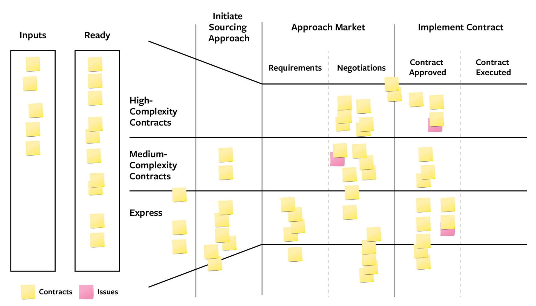
Mark needed a more structured and predictable method. He started the year with a new design. An initial meeting with the entire team focused on identifying the contracts that offered the most potential savings. Those contracts were then divvied up amongst the team. Each procurement specialist then tracked their portfolio of renegotiation efforts on their own visual management board — literally a piece of poster board, in this case. (See “Visually Managing Contracts.”) Each renegotiation went on a sticky note and was tracked as it moved through the key stages of the process. Efforts at risk of not meeting their savings targets were clearly highlighted.
Visually Managing Contracts
In BP’s North American supply chain group, poster boards and sticky notes made the work of renegotiating contracts visible so that issues could be identified and solved quickly, and the right tasks prioritized.
When it came time for the weekly or monthly meeting, each person just picked up their board and brought it to the meeting. Now the status of all the negotiations, the projected savings, and problematic contracts were visible to everyone every week. The new, data-driven meetings helped the team spot problems early and marshal the right resources to solve them. They were also both shorter and more helpful.
Each stage of a renegotiation was represented by a column of the board and the rows broke the work into different levels of complexity. Some were straightforward (bottom row) and moved more quickly, some were complex (top row) and required more thought, and others were somewhere in between (middle row). Each sticky note represented a different renegotiation currently in progress and its status (on track, behind schedule, at risk). The board’s “funnel” shape captured the idea that some projects were not as promising as initially thought. They would get dropped early and replaced by a more promising one. The resulting transparency helped escalate emerging issues to Mark’s entire team so they could be resolved quickly.
Choosing when to start the negotiations and how many to pursue at once were important decisions for each specialist. Following the concept of regulating for flow, they didn’t want to start a negotiation that would get dragged out needlessly, because there were too many already in progress. The sticky notes in the “ready” column set the priority and showed the next negotiations to start when there was an opening. It was easy for each person to see when they were ready to open another negotiation or when they were too busy, helping to ensure that once a negotiation started, it would keep moving until it was completed. The team began to produce regular, predictable results every quarter instead of a huge, unpredictable burst of savings at year’s end.
These simple boards bring the first four principles of dynamic work design alive. Taking the work out of spreadsheets, emails, and to-do lists allows everyone to participate in choosing the right set of negotiations to meet the team’s targets. The question of “Are we negotiating the right set of contracts?” follows naturally and often leads to discovery and new insights (“We do it that way?”). For Mark, a one-hour weekly meeting kept him connected to the work and the people doing it while eliminating dozens of emails and hallway conversations. Highlighting contracts that were not progressing meant that such problems could be escalated to the weekly team meeting, where the group could use their experience and problem-solving skills to help get them back on track.
Visualizing the work allowed Mark’s team to collaborate in new ways that resulted in accurate forecasts of the quarterly and annual cost reductions and eliminated the year-end turmoil in the budgeting process. More importantly, the team delivered about 30% more annual savings than was previously thought possible and more than a billion dollars in the space of three years, with 30% fewer staff members.
Making Visual Management Work for You
Visual management can be a powerful tool for improving the execution of otherwise invisible work. Every effective visual management system, however, is a bit different, and building one requires some experimentation. Four guidelines can help you develop one faster and more reliably.
The magic is in the conversations, not the sticky notes. Most importantly, remember the goal of visual management is to allocate scarce managerial time and energy effectively by fostering high-quality conversations. Simple, clear, and a bit messy is much better than perfectly “coiffed” and disconnected from the work. The sophistication of a board is irrelevant if it doesn’t facilitate collaboration. Put differently, the best board in the world is useless if people don’t meet in front of it regularly to test their understanding of the system they are managing and then use it to make decisions and solve problems. If your early attempts lead to productive conversations about the status of your organization’s work, where progress is being made, where problems are getting in the way, and where lessons are learned, then you’re headed in the right direction.
When teaching visual management, we invariably get questions about using digital tools. One of our executive MBA students once said, “I get the approach, but the sticky notes just feel so … 1980s.” Digital representations can be effective and offer several options that you can’t replicate with sticky notes and markers, including integration with other systems, regular backups, and remote participation. But when moving to electronic platforms, don’t let the available features distract you from keeping it simple and clear. Digitizing the boards can easily pull you into “automating” the board, and from there it is all too easy to spend more time formatting the board than having the right conversations. Simpler is usually better. In our experience, the biggest risk of moving to digital representations is that people will skip the meetings and say, “I’m busy and can’t make the meeting, but I’ll check the board later.” The moment that happens, you lose the magic.
Your first attempts at visual management are likely to be frustrating. When you start laying it out on the wall, you will likely find that you don’t understand the work as well as you thought you did. In our experience, few managers really understand the entire system through which work gets done. You may struggle to choose the right representation and identify good labels for the rows and columns. Initially, everything can feel like a special case that doesn’t quite fit the board layout you have chosen. Don’t worry — it’s a natural part of the process. Each iteration brings new questions and insights, and soon the board begins to look like the work feels.
The board is messy because the work is messy; the work is messy because it has lots of problems. The good news is that seeing the messiness will help you start fixing the work. Years of living in a chaotic, overloaded organization results in work processes that are largely ad hoc and undocumented. Efforts to create an effective visual management system will help unearth the targets, what work is in progress, who is doing it, and the issues they are facing in getting it done. Don’t shy away from the messiness. Dig in and start fixing the issues you find. For example, creating a visual board often forces leaders to clarify the targets that they’re giving their teams. Similarly, initial efforts to get all of the activities onto the wall usually reveal significant overload and start the process of eliminating low-value projects. As each small change improves the system, the workflow will be easier to represent on the board.
Your board will evolve. Once you get a visual system working, don’t get too comfortable with it. In our experience, good visual systems evolve quickly as the work improves and people get better at using their boards to guide problem-solving and decision-making. It is a good practice to check in every quarter or so and ask, “Does this board look like the work feels? Does it represent the way our work gets done?” If the answer is no, then it’s often time to reconsider it. Every so often, a manager we worked with at the Broad Institute would buy a case of beer on a Friday afternoon and invite her team to redo their boards. Sticky notes and tape would come down, and they would experiment with new representations. These are important check-in points that allow people to step back from the day-to-day flux of doing work and revisit the process of how work gets done.
Human beings are natural problem solvers, and problem-solving can be a major engine of organizational performance. But “solving” a problem with a private work-around often does the opposite. Moving otherwise invisible work out of the organizational shadows through simple visualization tools can redirect our natural instincts in ways that improve the performance of the overall system and open up an entirely new universe of possibilities. “A picture is worth a thousand words” is more than a simple adage. Representing complex work visually conveys more information, more quickly and more clearly, than trying to do so verbally. It will also challenge what you think you know about your own work and how it all fits together.
References
1. S. Dodge, D. Kieffer, and N.P. Repenning, “Breaking Logjams in Knowledge Work,” MIT Sloan Management Review 60, no. 1 (fall 2018): 47-54; N.P. Repenning, D. Kieffer, and J. Repenning, “A New Approach to Designing Work,” MIT Sloan Management Review 59, no. 2 (winter 2018): 29-38; and N.P. Repenning, D. Kieffer, and T. Astor, “The Most Underrated Skill in Management,” MIT Sloan Management Review 58, no. 3 (spring 2017): 39-48.